The stacked Emerson wordmark is our primary identifier, and the preferred version of our logo—especially for more formal or externally facing usage. It represents the College in fullest context, whenever it’s necessary or beneficial to do so.
For communications and materials that may be more primarily internal in nature, or in cases where there it provides a functional or visual benefit, this stand-alone version of the wordmark can be used.
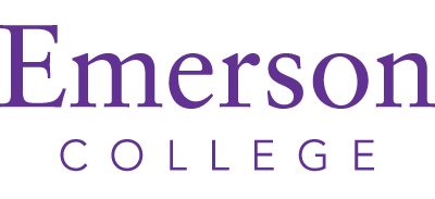
A horizontal version of the wordmark may be used in areas where vertical space is limited. It would be ideally used on the Emerson website.

ONE COLOR / GRAY SCALE
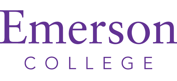
ONE COLOR / PURPLE
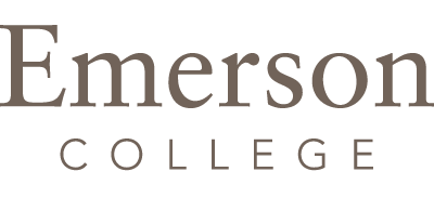
ONE COLOR / GRAY
REVERSED / GRAYSCALE
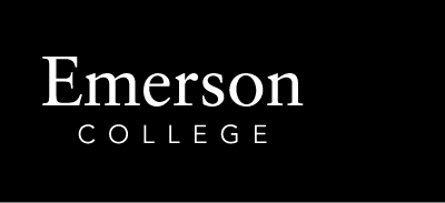
REVERSED / COLOR

CMYK: 76 97 0 0
RGB: 98 38 158
HEX: #62259D

CMYK: 52 53 59 24
RGB: 112 98 89
HEX: #706258

CMYK: 87 96 40 44
RGB: 47 26 69
HEX: #2F1A45

CMYK: 97 100 8 10
RGB: 48 43 125
HEX: #302B7D

CMYK: 67 98 6 1
RGB: 117 47 138
HEX: #742F8A

CMYK: 64 0 32 0
RGB: 76 193 187
HEX: #4CC1BA

CMYK: 80 12 1 0
RGB: 0 168 225
HEX: #00A7E1

CMYK: 2 100 62 0
RGB: 232 25 77
HEX: #E8194D

CMYK: 29 1 100 0
RGB: 196 214 0
HEX: #C3D500

CMYK: 0 18 100 0
RGB: 255 205 0
HEX: #FFCD00

CMYK: 0 73 98 0
RGB: 252 76 2
HEX: #FC4C02


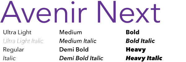
Emerson’s primary sans-serif typeface is Avenir Next, which is meant to be a visual expression of the modern relevance and impact the College can have on today’s world. It offers a wide range of weights that can be applied to both large headlines or display type and smaller body copy. It can be used in tandem with Sabon (see below).
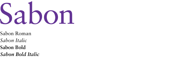
Emerson’s serif typeface is Sabon, a classic style that helps convey the College’s integrity and rich history. This typeface can also be applied to both headlines or large display type and smaller body copy. It can be used in tandem with Avenir Next (see above).
FF DIN OT is our alternative sans-serif option and should be used sparingly. It is best used when featuring a bold headline or for placing more emphasis and effect on certain areas of content.