Core Colors
Purple is an essential part of Emerson’s identity. Emerson Purple is our primary brand color and should have a strong presence across our communications, creating an immediate and recognizable connection to Emerson.
Midnight Purple and Black are grounding colors within the core palette. Inspired by the theater and film stage, they provide contrast for our brighter colors and help amplify the energy of the overall palette.
Emerson Purple
PANTONE: 267 C
CMYK: 81, 99, 0, 0
RGB: 95, 36, 159
HEX: #5F249F
Midnight Purple
PANTONE: 2695 C
CMYK: 89, 100, 0, 58
RGB: 46, 26, 71
HEX: #331467
Black
PANTONE: BLACK C
CMYK: 0, 0, 0, 100
RGB: 0, 0, 0
HEX: #000000
Taupe
PANTONE: 11-4201 TCX
CMYK: 4, 4, 15, 0
RGB: 244, 237, 217
HEX: #F4EDD9
White
PAPER COLOR
CMYK: 0, 0, 0, 0
RGB: 255, 255, 255
HEX: #FFFFFF
Secondary Colors
Our secondary palette brings additional energy and flexibility to the brand. Once Emerson Purple has been established, these colors can be used to create more expressive, dynamic, and nuanced applications.
Bright Purple
PANTONE: 265 C
CMYK: 54, 67, 0, 0
RGB: 155, 85, 255
HEX: #9B55FF
Story Pink
PANTONE: 2037 C
CMYK: 1, 48, 0, 0
RGB: 255, 143, 204
HEX: #FF8FCC
Emerson Gold
PANTONE: 1235 C
CMYK: 0, 25, 94, 100
RGB: 255, 184, 28
HEX: #FFB81C
Bright Teal
PANTONE: 2235 C
CMYK: 76, 11, 28, 9
RGB: 34, 160, 160
HEX: #22A0A0
Vermilion
PANTONE: 485 C
CMYK: 0, 95, 100, 0
RGB: 232. 50, 31
HEX: #E8321F
Sky
PANTONE: 6127 C
CMYK: 59, 5, 14, 1
RGB: 87, 175, 196
HEX: #6EC7E2
Color contrast & accessibility
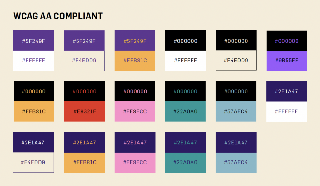
Accessible color contrast helps ensure that digital content can be read by people with low vision. Use WCAG AA-compliant color combinations for body copy and essential information, and take extra care when placing text over photography or other complex backgrounds. If you’re unsure whether a color combination meets accessibility standards, check it with the free WebAIM Contrast Checker.