Typography is an important part of how the Emerson brand looks and feels. Our three brand typefaces work together to create a visual voice that is creative, confident, and distinctly Emerson, helping us tell our stories with clarity and personality.
These typefaces and their approved weights should be used consistently across print and digital communications whenever possible. Consistent use of our typography helps create a strong, recognizable identity across everything we make.
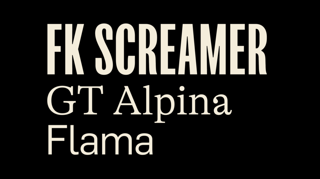
FK Screamer
FK Screamer is a condensed sans serif designed by Florian Karsten to be reminiscent of movie titles in the early to mid-20th century, AKA “The Golden Age of Film.” It features the medium contrast in stroke weights and organic touches characteristic of early grotesk-style typefaces. Although it comes in three weights, the Emerson brand only uses the medium. It is designed to perform well when set large, tight, and in ALL CAPS to create distinct, bold headline blocks.
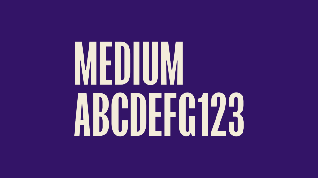
GT Alpina
GT Alpina Standard is the creation of Roman Moser at the Swiss foundry Grilli Type. It features the bracketed serifs and ball terminations of Century and Scotch Roman but with lower contrast, giving it a workmanlike, friendly, but bookish feel.
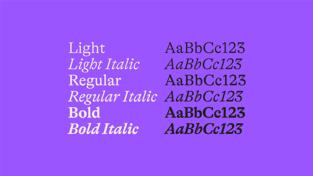
Flama
Feliciano Type foundry originally designed Flama to be a signage font. It has come to be used in diverse media, including broadcast and editorial publications. The geometric sans serif family and neutral character, make it ideal for indexical uses, footnotes, and labels.
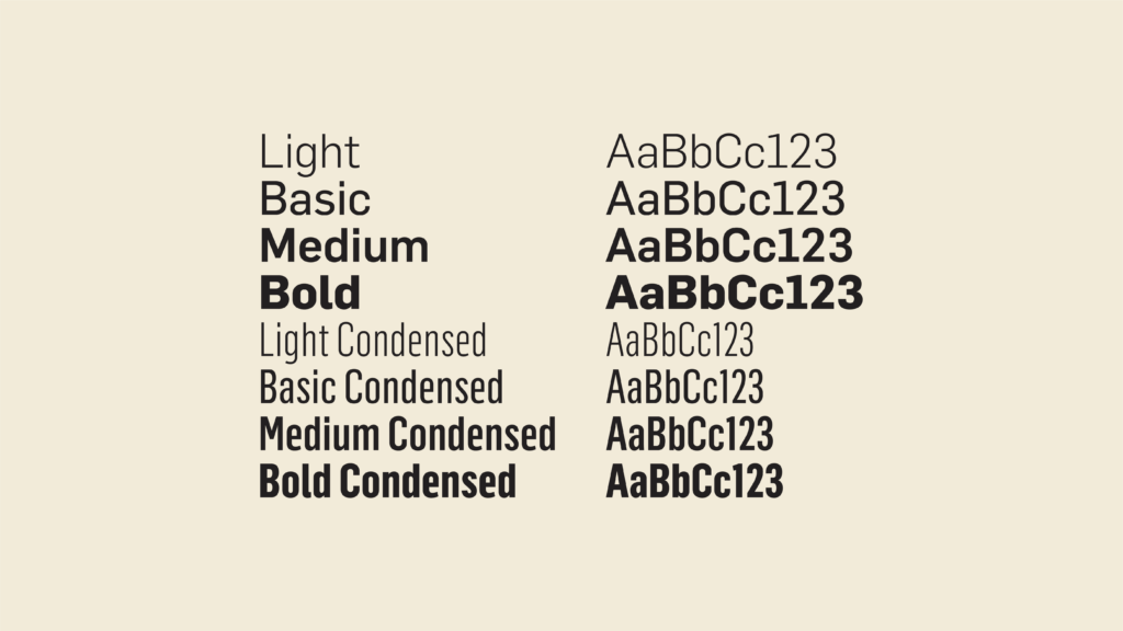
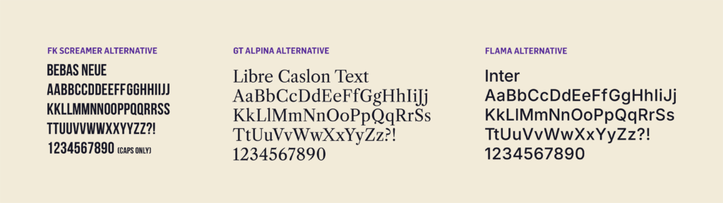
Google Fonts Alternatives
If you don’t have access to Emerson’s licensed brand fonts, these open-source Google Fonts can be used as free alternatives. They were selected to reflect the key characteristics of our brand typefaces and maintain a consistent look and feel across Emerson communications.